Context
This case study was developed in the UX Fundamentals Bootcamp at the Interaction Design Foundation August – November 2021. The Bootcamp took us through the five Elements of User Experience as defined by Jesse James Garrett:
- Strategy: User Research, Personas, Journey Maps, POV and HMW.
- Scope: User Task Flow
- Structure: Information Architecture
- Skeleton: Wireframes
- Surface: Prototype, Pattern Library
1. Strategy
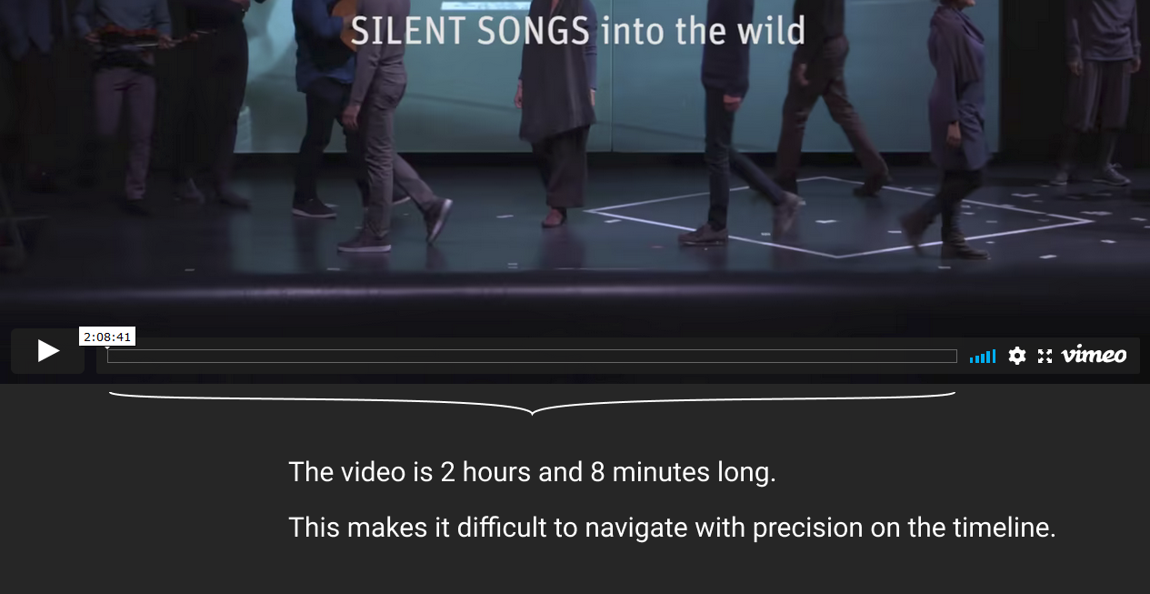
I encountered the problem in my work as a performer. While in rehearsal with my colleagues, having a full-length video documentation on Vimeo of our show, we found it difficult to try to navigate with precision on the timeline of the video.
Problem Statement
I am a performer in rehearsal. I’m trying to view a scene in which i perform, in a video documentation of our show. But I find it difficult to find the scene, rewind, loop or navigate with precision through the full video because the video is very long and the scene is very short. This makes me feel frustrated.
Background Research
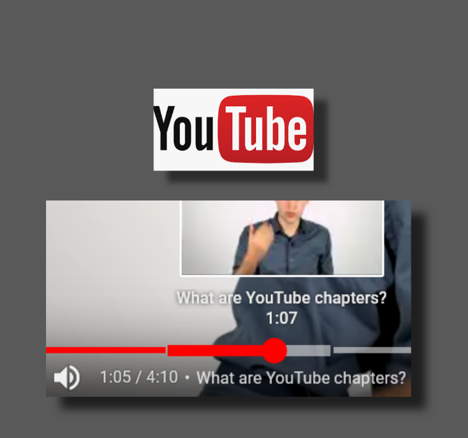
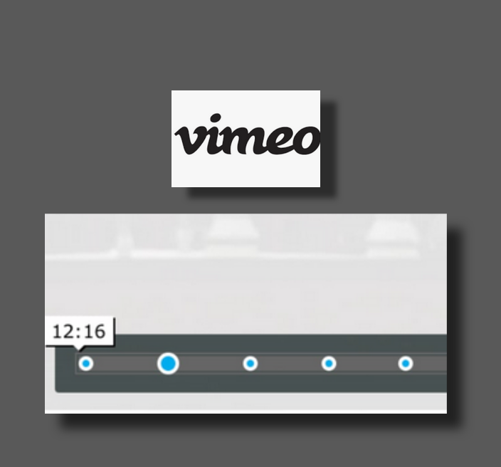
Shown here is a feature comparison using YouTube, Twitch, Netflix and Instagram as a means to better understand what makes Vimeo’s offer different from others. The feature comparison revealed differences in:
- Timestamp display
- Visualizing chapters versus moments
- Thumbnail image
- Availability or exclusivity of the feature

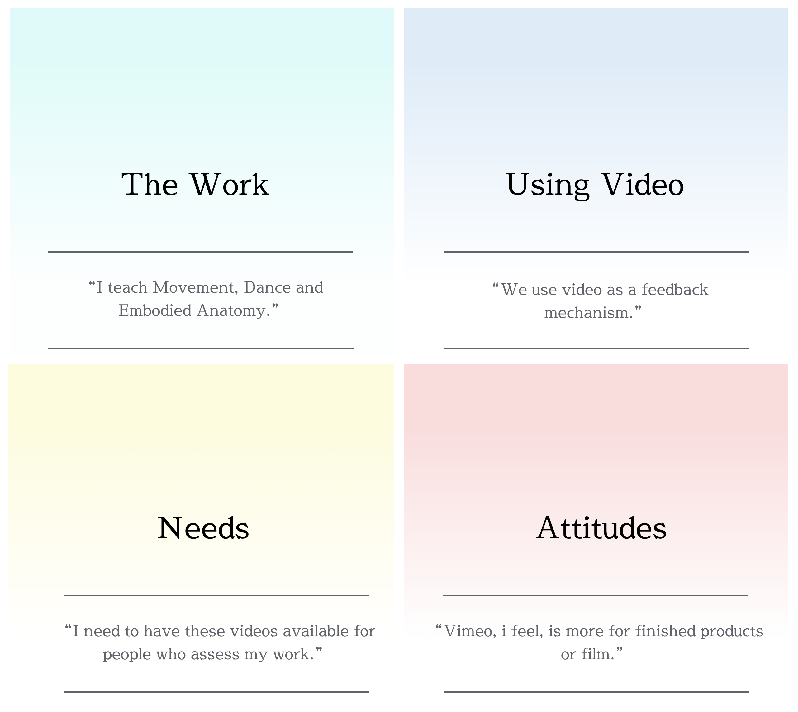
User Research
To learn directly about Users’ experiences around the Vimeo platform, semi- structured user interviews were conducted.
Four themes emerged from the the Interviews:
- The work context
- Using video in the work context
- Needs
- Attitudes towards video platforms
Two personas were created for two different work contexts that emerged from the Interviews:
- Creative Work
- Educational Work
Personas
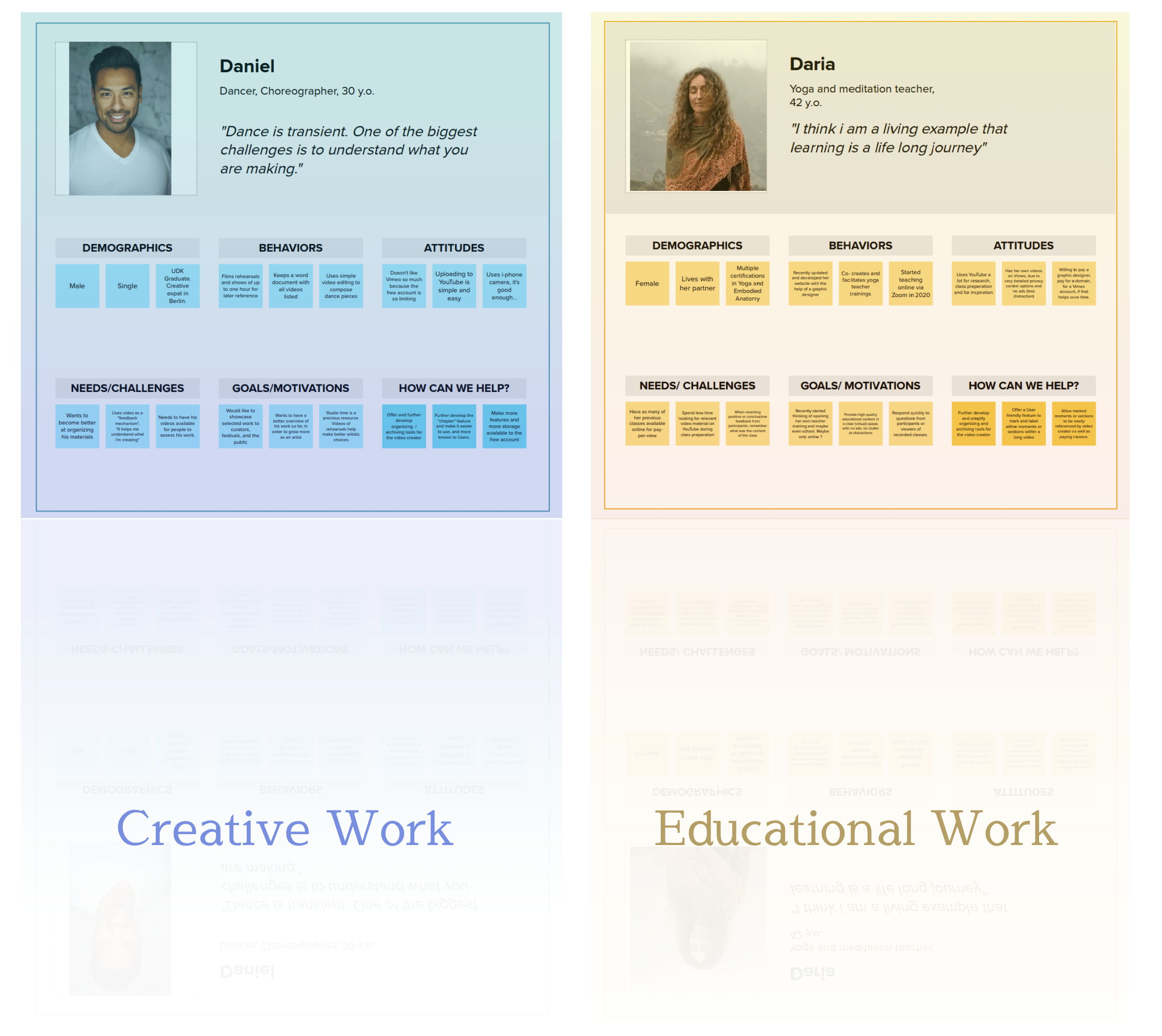
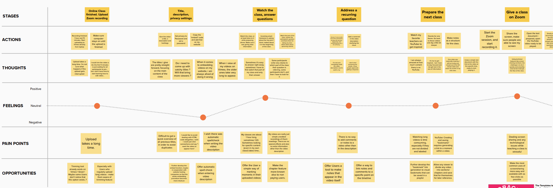
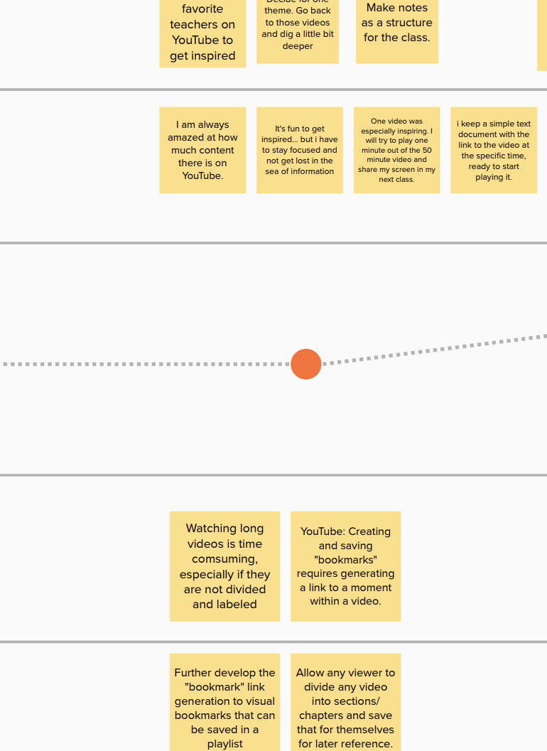
This was further elaborated using Empathy Maps and Customer Journey Maps for chosen User Scenarios.
Customer Journey Maps


One POV statement to focus on
Finally, one POV Statement and its HMW questions were chosen as the base for the continued work on a UX Proposal.
A Dancer needs to be able to view short sections within a two hour long video during rehearsal because he is helping a new dancer learn her role. They are both relying on the video documentation to either recall the choreography or to learn it from scratch.
- How might we help the user find a short scene within a very long video ?
- How might we help the user view a short scene again and again ?
- How might we help the user study video material in detail ?
- How might we support a dancer make notes that refer to specific moments in the video?
- How might we support the different users in sharing their notes ?
2. Scope
User Task Flow
The task flow shown here describes actions and choices in:
- finding a part of a video (for example a chapter)
- viewing the chapter: once, several times, or
- viewing a scene within the chapter: once or several times.
- searching for the next chapter, either by fast forwarding or scrolling on the timeline.
these actions and choices point to several design opportunities (4 magnified sections from the task flow, shown below clockwise from top left):
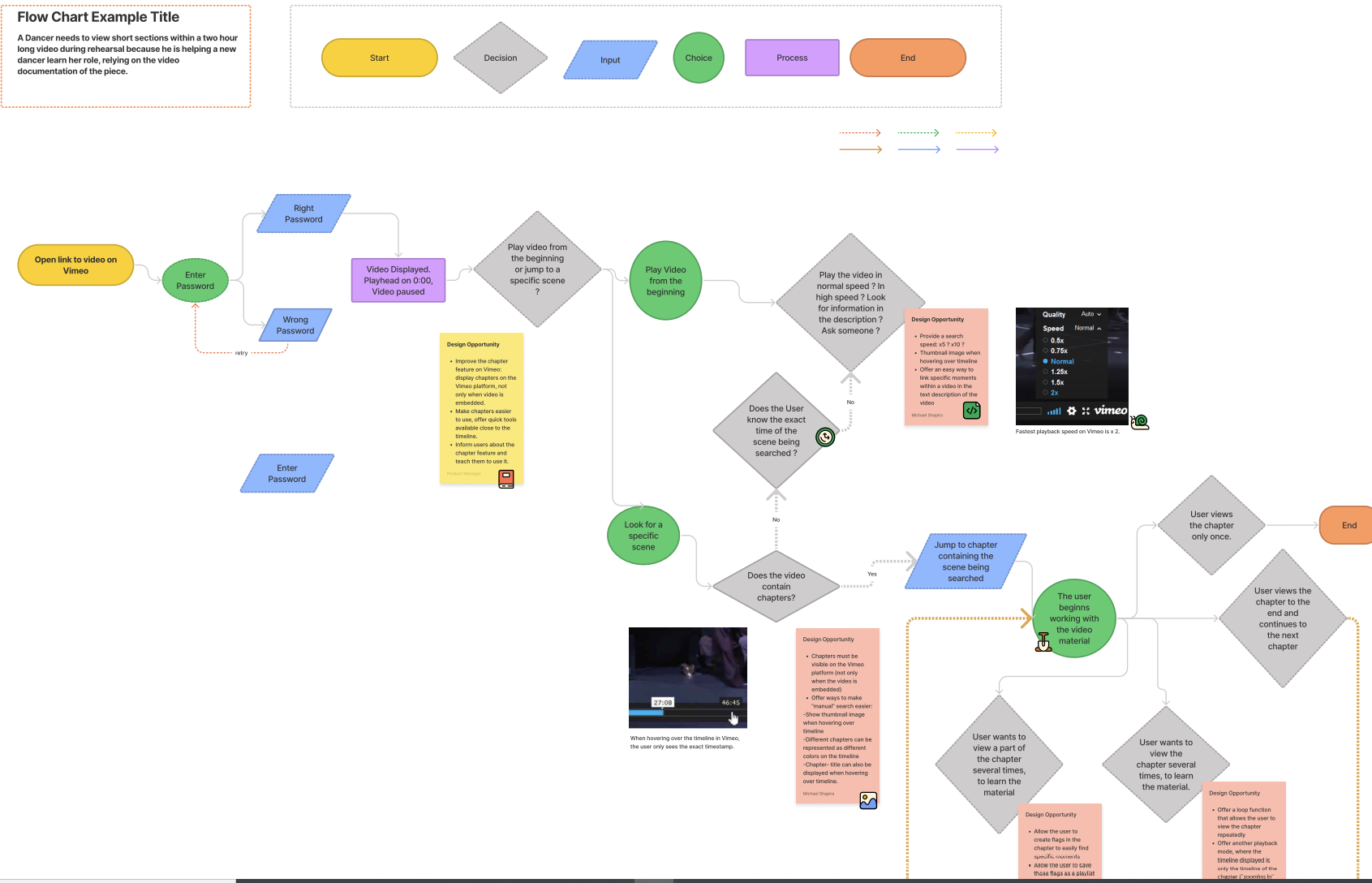
- Make the chapters appear on the Vimeo platform and not only when video is embedded
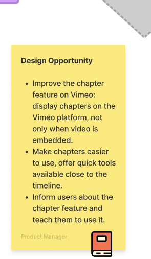
- Add more playback speeds to also cover a range of “search speeds” 5x, 10x etc…
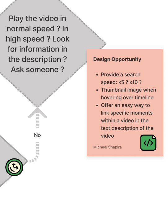
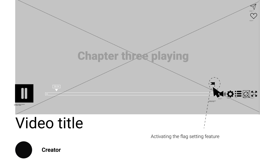
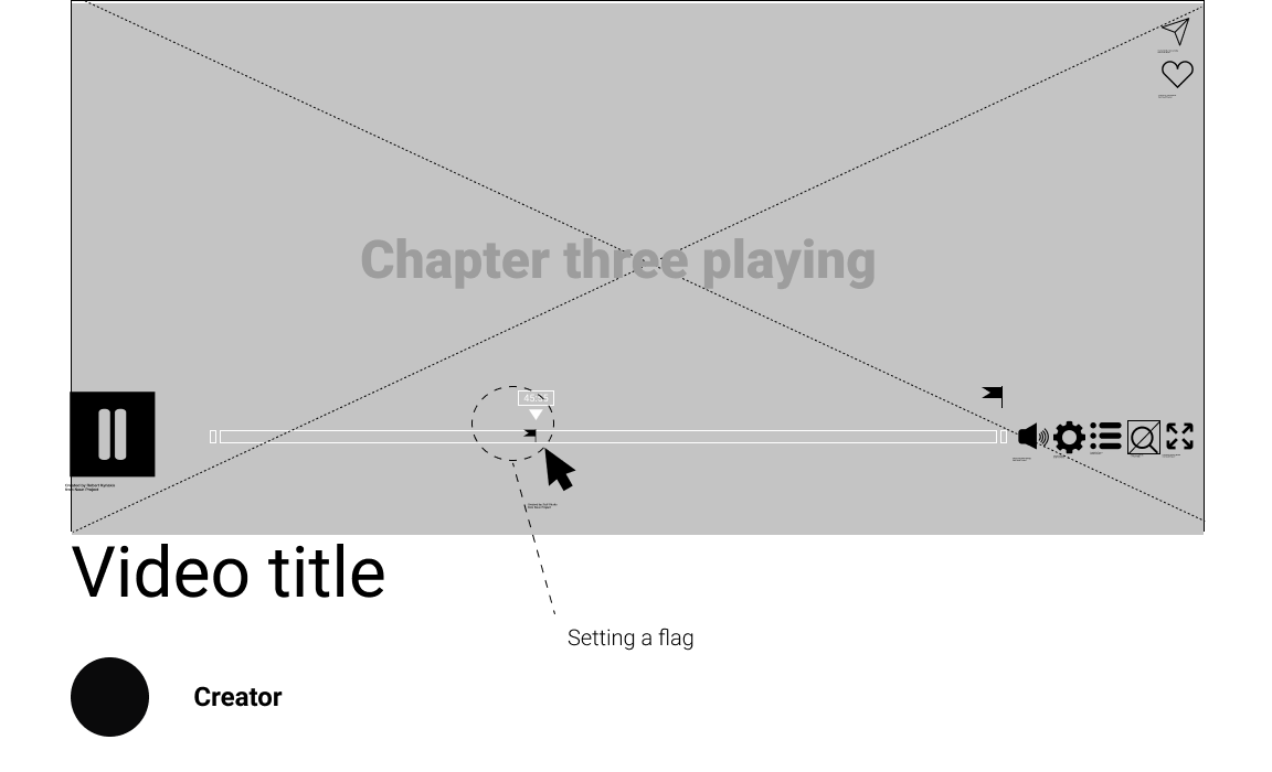
- Offer a flag setting feature available to anyone, not only the video creator.
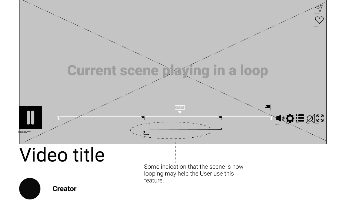
- Once the flag feature is there, offer a loop playback mode
- Offer a new playback view, where only a part of the video (for example, a chapter) is displayed as the current timeline. In other words, offer a Zoom-in-on-timeline feature.

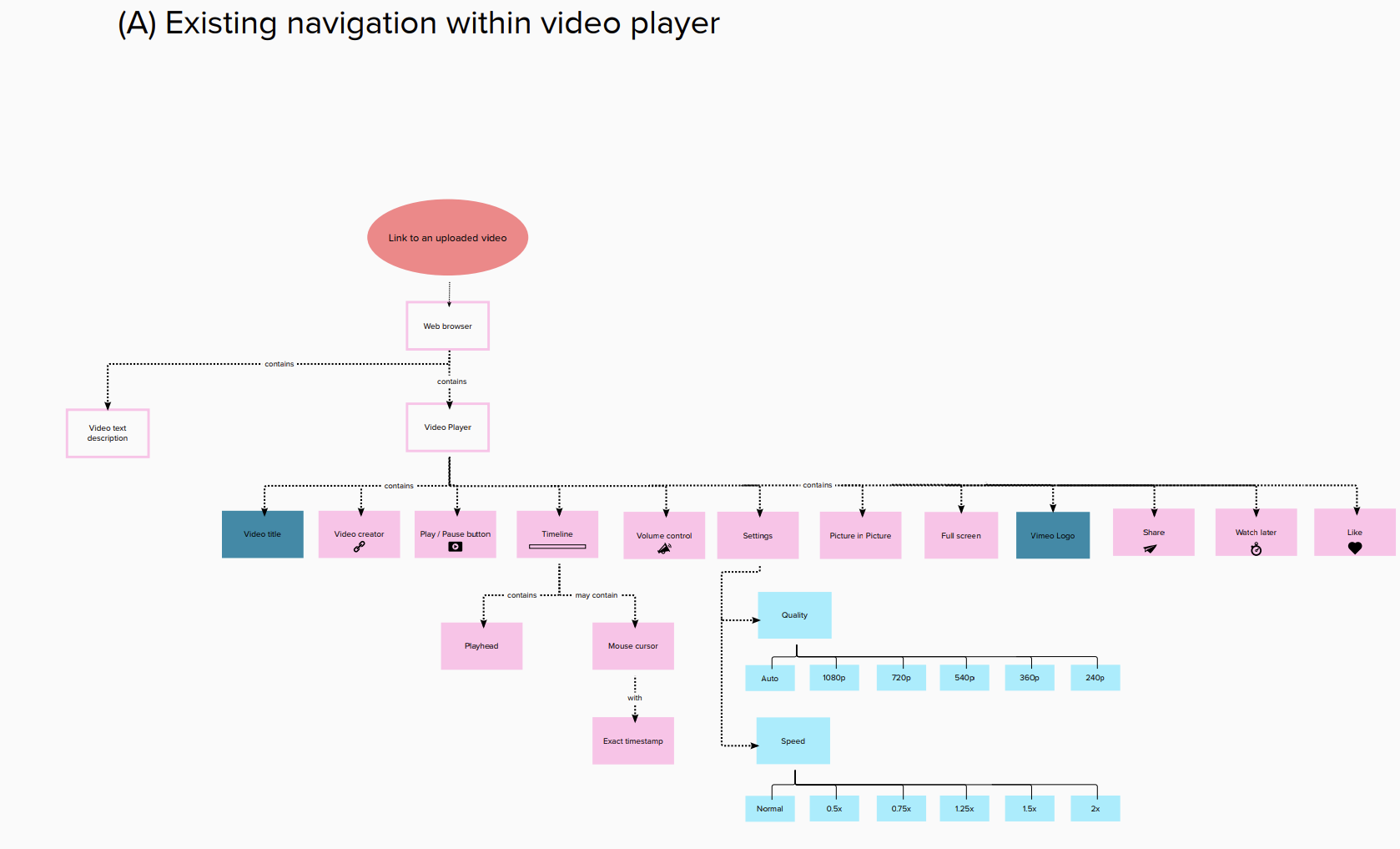
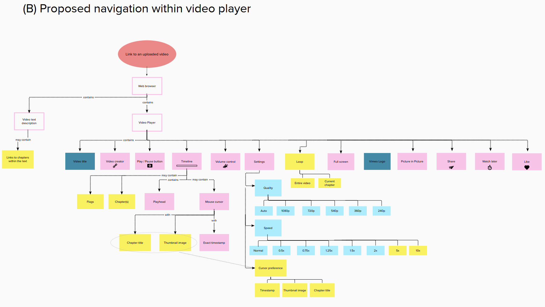
3. Structure
The Information Architecture was meant to show the Vimeo video player itself, not the entire Vimeo webpage. Based on the IA of the existing video player (A), a second IA diagram was made (B) describing how some design opportunities could be implemented into the player’s architecture..
4. Skeleton
From lo- fidelity wireframes…


to hi-fidelity wireframes (Figma).


Credits (icons):
List by Chintuza from the Noun Project * pause by Robert Kyriakis from the Noun Project * Settings by Iconic from the Noun Project * play by Robert Kyriakis from the Noun Project * Volume by MRA Design from the Noun Project * Full Screen by Bradley Wilton from the Noun Project * magnify by Alice Design from the Noun Project * Circle by Hea Poh Lin from the Noun Project * Cursor by Zaff Studio from the Noun Project * Loop by Vectorstall from the Noun Project * Information by David Khai from the Noun Project * Share by Muhammad Ridho from the Noun Project * like by Icon Master from the Noun Project * fast forward by IconMonk from the Noun Project
5. Surface
Prototype
The prototype resembled the Wireframes, but was simplified visually, making it more suitable for Usability Tests.


Pattern Library
Here are some design ideas, manifested in the prototype. The implementation of these design ideas was not meant as a finalized visual UI Design, but rather was intended to bring the prototype to a state of coherency and clarity and serve the usability tests.

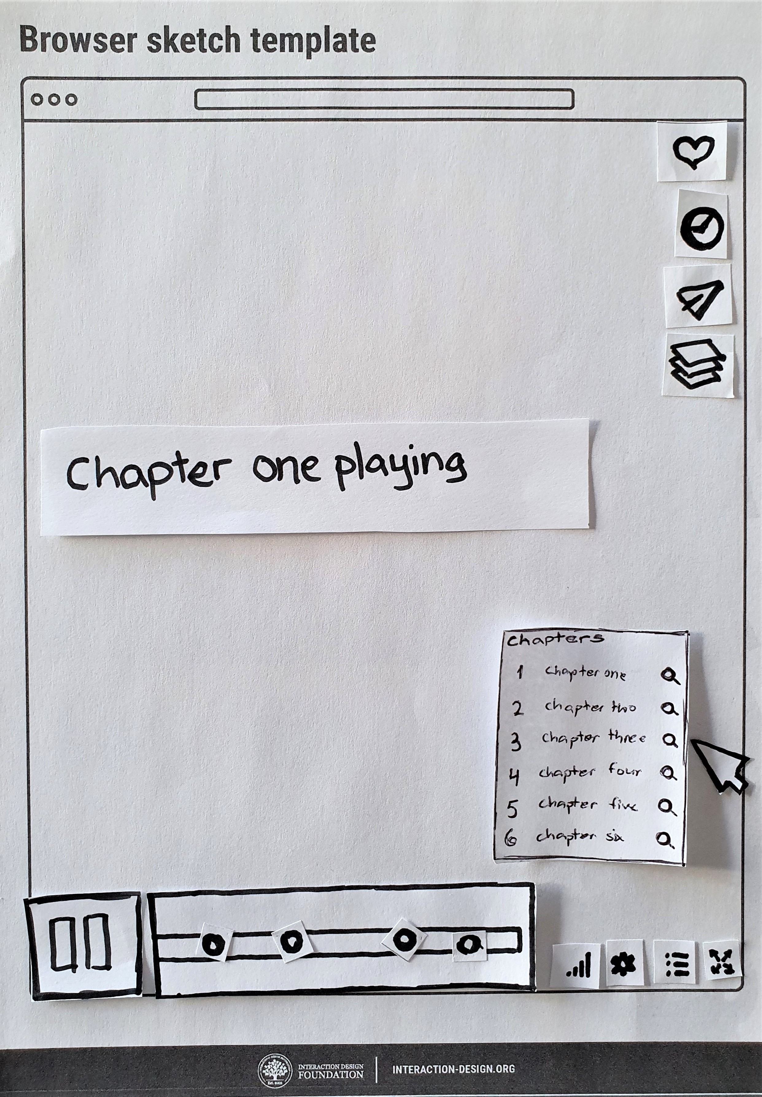
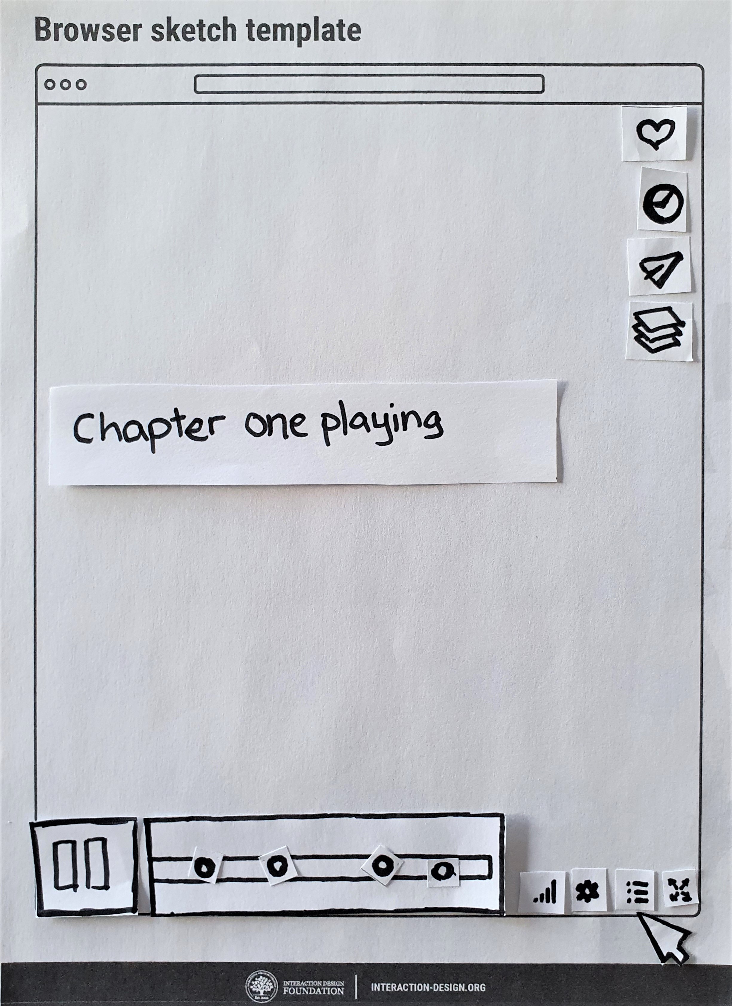
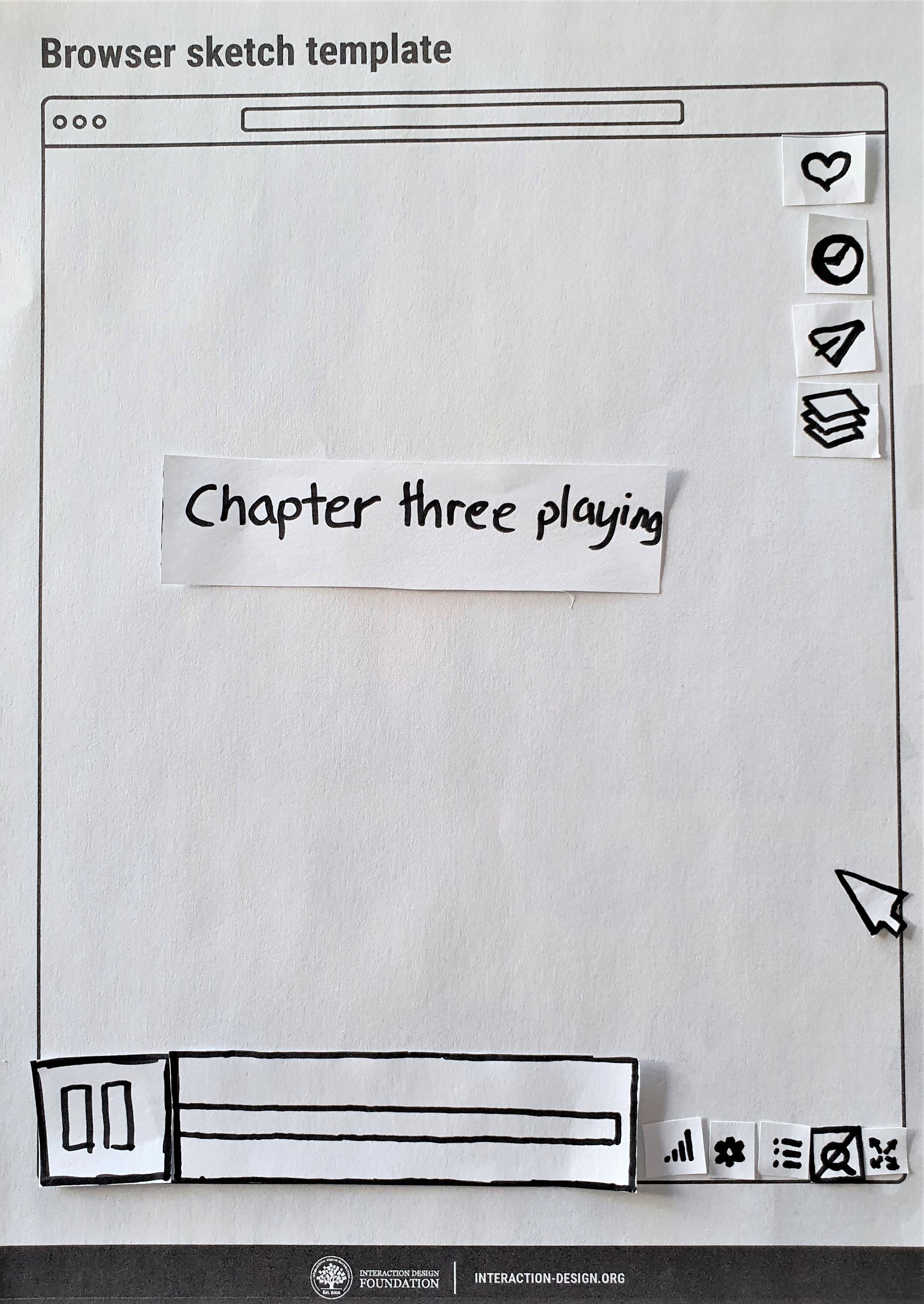
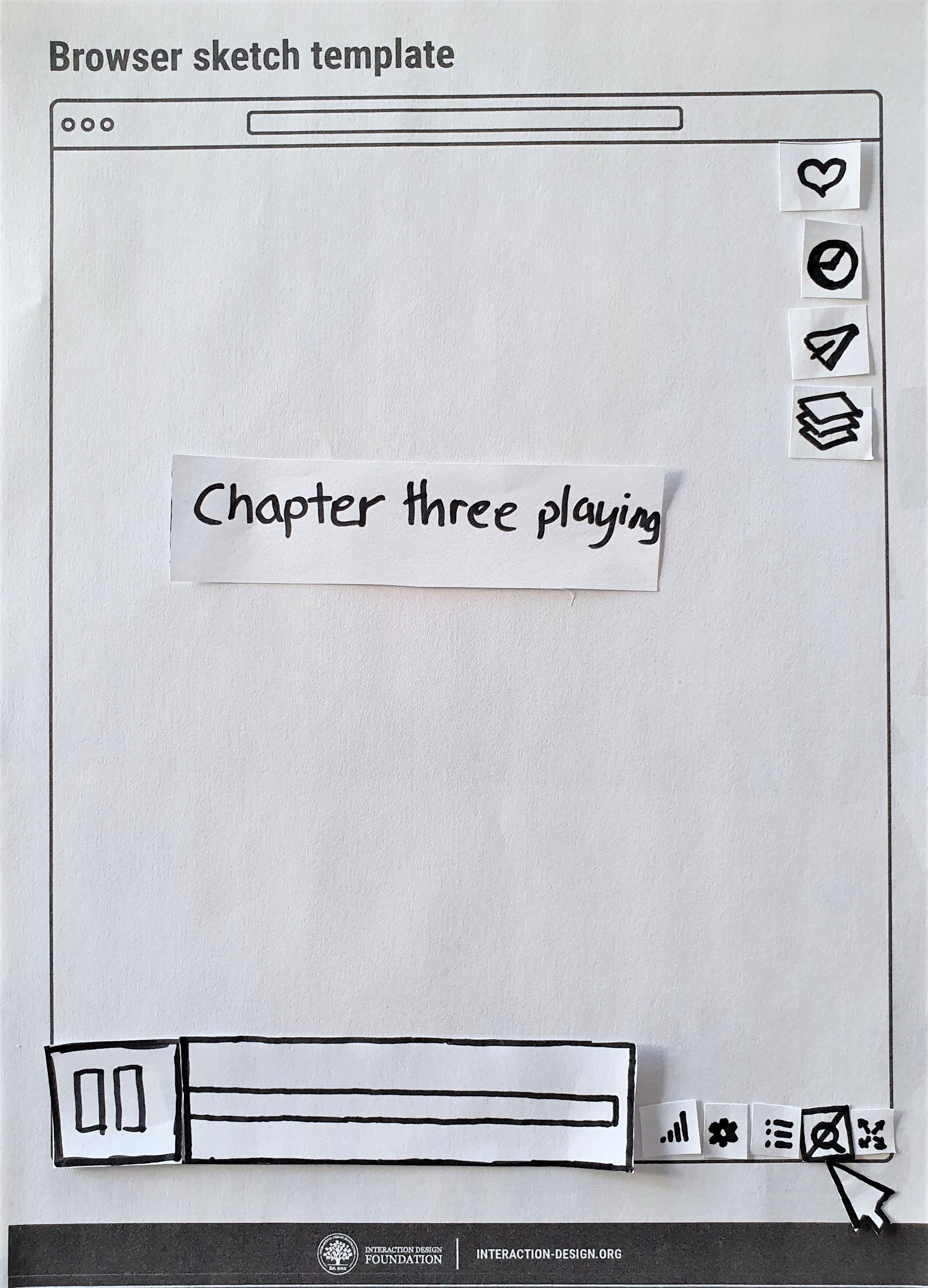
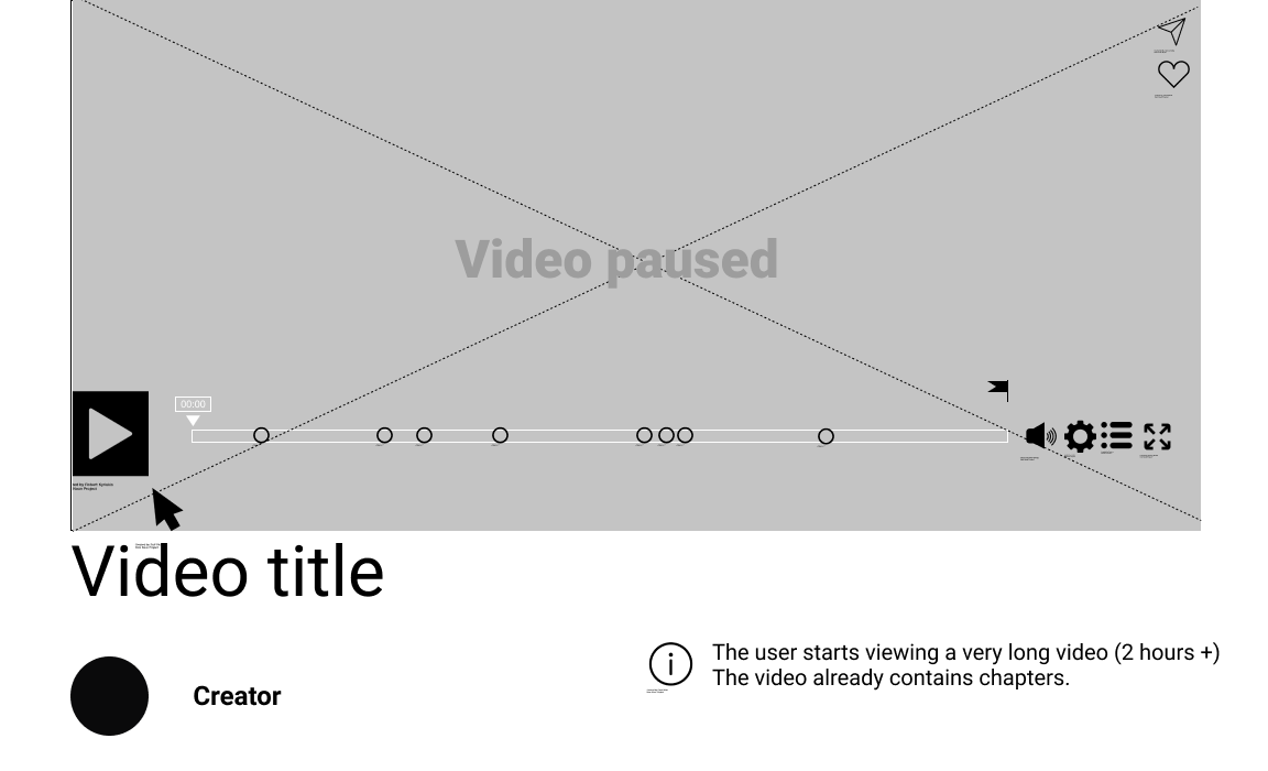
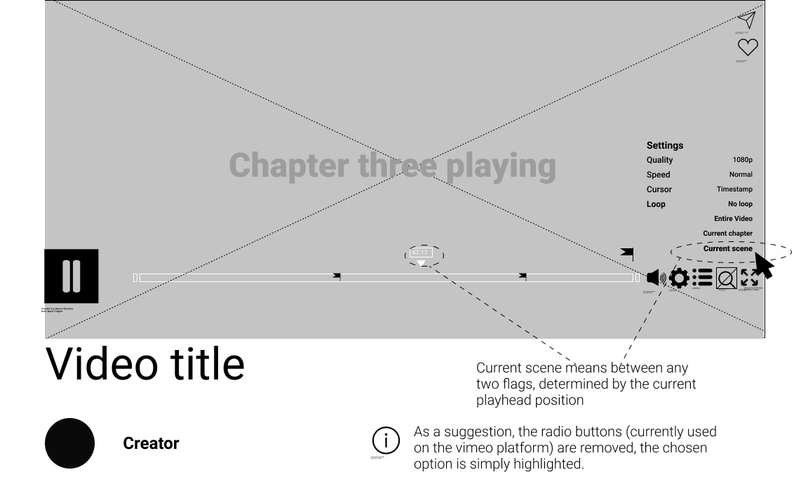
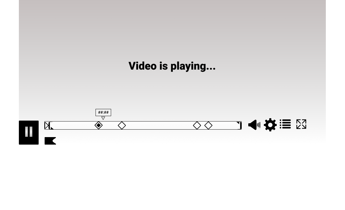
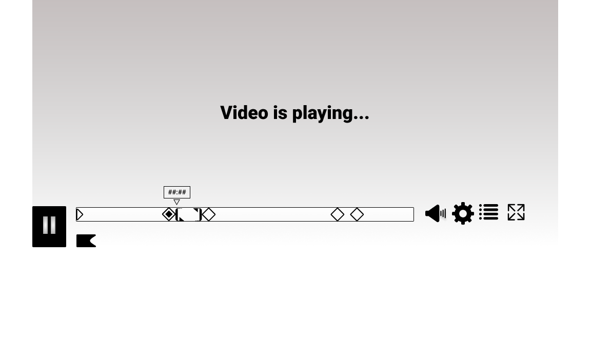
The Timeline in its full view includes chapters. Each chapter is marked only at its beginning point by a marker in one of two states: hollow or full. This indicates whether the chapter is currently being played or not.
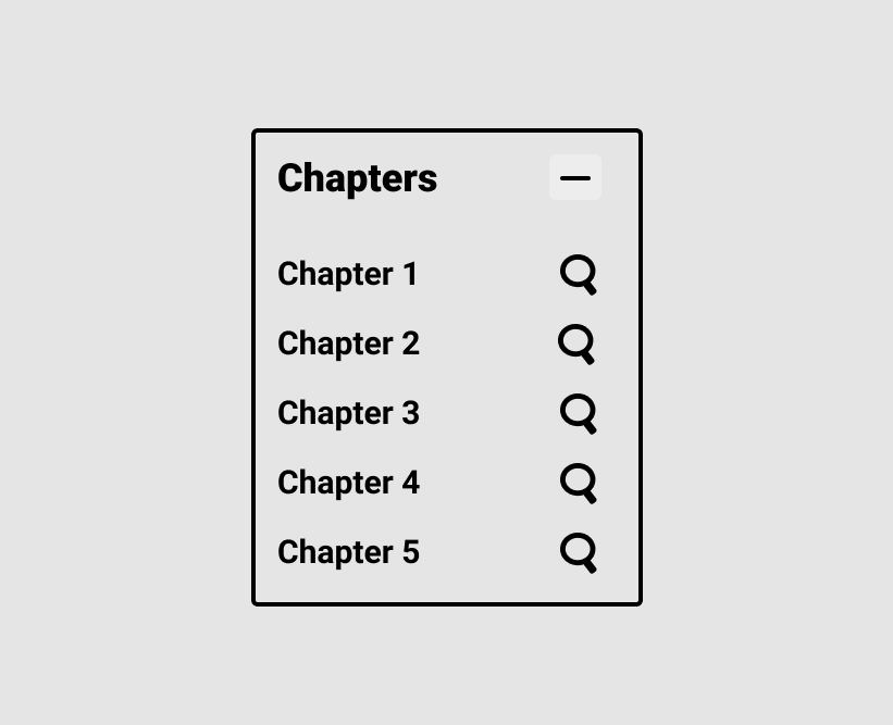
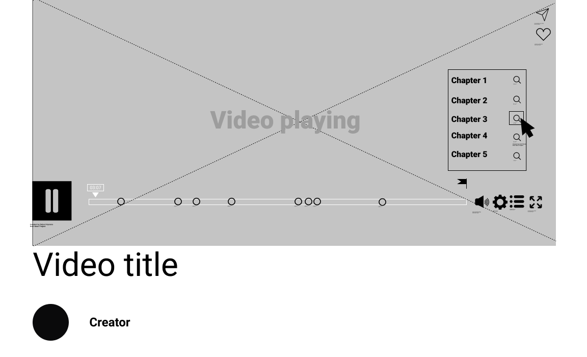
The chapter menu can be used to either simply jump to a chosen chapter, or with the magnifying glass icon, to view that chapter in “magnified view”.
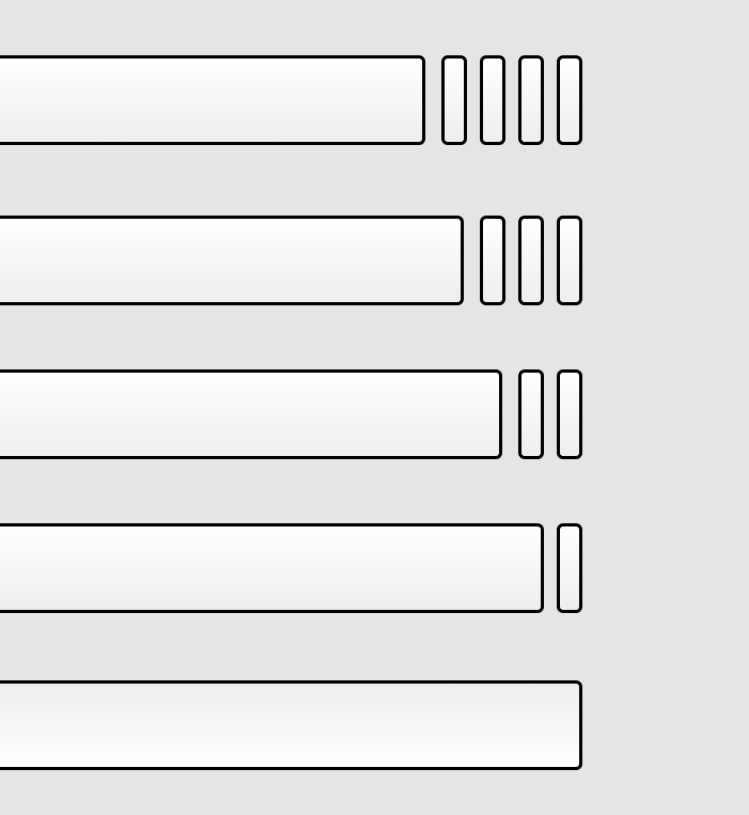
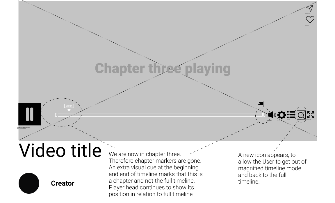
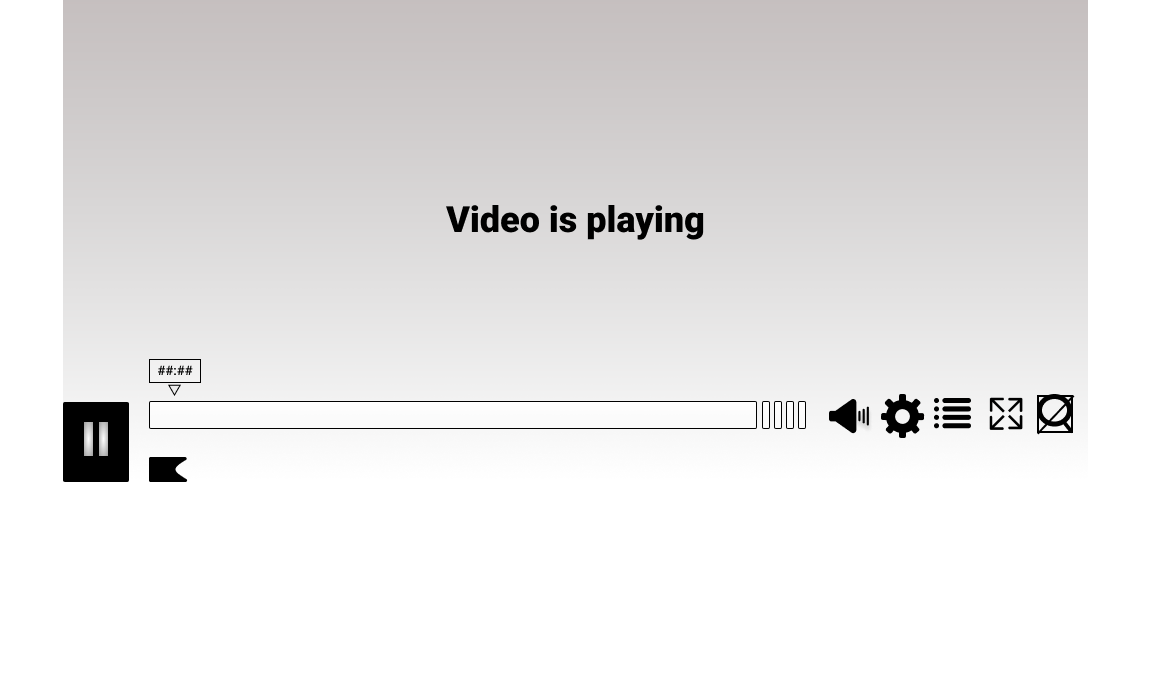
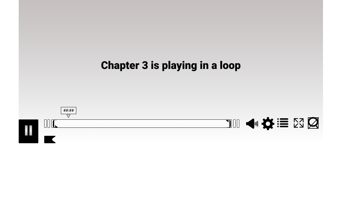
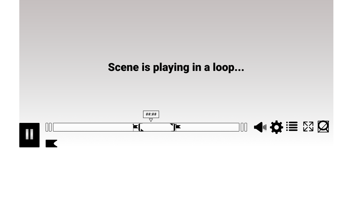
Inspired by google, and the design of its logo on search result pages, the magnified view of a single chapter’s timeline was designed to indicate where the User currently is, within the full length video. The number of “broken timeline pieces” indicates how many chapters are ahead or behind. The timeline (both full and magnified) is intentionally made taller to accomodate for flags, chapter- and loop icons. In this view, the chapter markers are gone, since the User is viewing a single chapter.
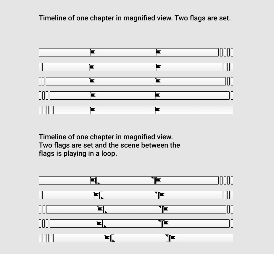
The UI Pattern Library covers examples of “magnified” timelines of 5 chapters, with one flag set, with two flags set, and with looped playback of the scene between the two flags.
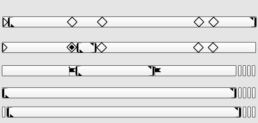
The loop playback indicator, has been broken down into two separate arrows: loop start and loop end. This allows to place the loop indicator anywhere: inside a chapter, inside a marked scene (between two flags) or around the entire timeline.
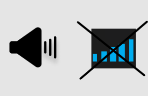
The chosen volume icon is a speaker shaped icon rather than the bar scale currently used on the Vimeo platform. This is meant to create consistency across devices when using the platform without causing irritation or confusion due to the similarity of the bar scale to the common cellular service icon.
