Context
This Usability Study was planned, carried out and presented in the User Research Bootcamp at the Interaction Design Foundation January – April 2022.
The Usability Study was the first out of three research methods, aimed at finding out how people in 2022 experience taking Yoga classes. The Usability Study focused on how people find and book classes via the Urban Sports Club app.
Method
- 4 participants, 4 sessions
- 4 tasks were given to each participants. When the participant was done with all 4 tasks, a short interview was conducted.
Findings

1. Participants found it difficult to use the search results on the map.
Observation: User clicks on 7 different results on the map to make sure they are relevant
Quote: “I’m not sure if these are all venues for Yoga or if this is just everything…”
Recommendation:
- Improve the search filter options. For example, a User looking for a Yoga class should be able to exclude fitness studios, dance studio, spas etc… if they want to.
- Work to eliminate dead ends. Studios that are temporarily closed, or irrelevant results should not appear on the map.
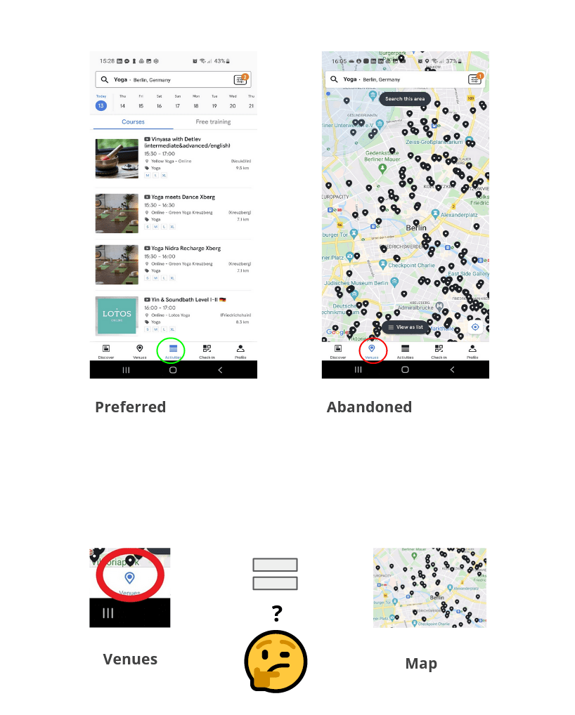
2. All participants without exception started a search in the Venues tab, only to then abandon it and switch to the Activity tab.
Observation: Beginning a search in the “Venue” tab, then switching to the “Activity” tab (all users)
Quote: “I would prefer the list in stead of the map.”
A possible explanation
The structure of the app creates a 1:1 relationship between “Venues” and “Map”. The “Venues tab” becomes synonymous with “Map”. This could be a source of confusion:
- Users don’t necessarily expect to find a map when choosing the Venues tab
- Users don’t necessarily think “Venues” when they want to view the map.
Recommendation:
- Easy solution: Rename the Venues tab to “Map”.
- Long term solution: More research ! Where in their process do Users NEED the map ? What do Users expect when they click on the Venue tab ?

3. Participants found it confusing and difficult to look for Online classes.
Quote: “I actually didn’t see the online option. I saw there were two places: Kreuzberg and Neukölln… and then I couldn’t choose online.”
Recommendation:
- Online classes should be referred to in one consistent way throughout the app and website, and in the search filters.
- The integration of the online offers in the search filters should make sense to the User.
Is it an Activity type ? Or is it a Venue type ?
Are toggle buttons the best UI choice for the search filters ? - Should online classes be shown on the map ?
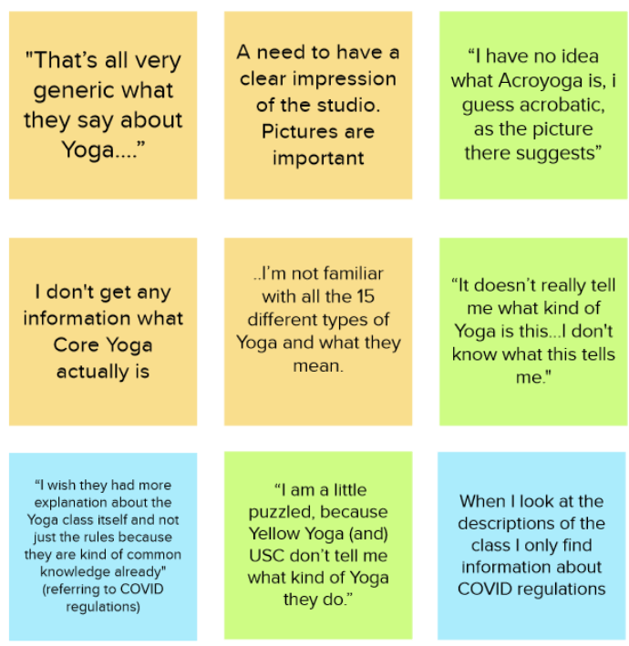
4. Participants wanted more information about the venue and type of Yoga.
Quote: “I’m not familiar with all the 15 different types of Yoga and what they mean.”
Quote: “It doesn’t really tell me what kind of Yoga this is. I don’t know what this tells me.”
Suggestion:
Develop an orientation section with information about different Yoga types…. Or let the Yoga studios provide the information on their websites, and link to that information in a consistent and accessible way.

5. Participants didn’t trust Covid information on the app.
Quote: “I don’t trust the COVID information on the app.”
Recommendation:
Decide and follow through:
Either refer to other sources of information on Covid regulations, or make sure the information on the app is up to date.
Conclusion
Urban Sports Club is making a great offer and Users recognize this !
However, the Usability Study showed Users had difficulty navigating through the app and felt somewhat overwhelmed. The average SUS Score was 62.5 which is considered poor according to uiuxtrend.com.
Urban Sports Club would benefit from building a more coherent experience into the app and website. This would empower the USC users to make small everyday decisions with more clarity, confidence and ease.
